What is Bootstrap?
All of us in the CS and IT domain are very much familiar with the term “Web development”. It basically means to develop a webpage or a website. Web development on a bigger scale contains two main parts i.e. Front End and Back End. Bootstrap is a front end framework that is created by Twitter. It helps in the creation of mobile first and responsive websites. It contains a collection of HTML, CSS, and JavaScript elements, including buttons, forms, navigation bars, and more, to make the process of designing a unified and eye-catching user interface easier and faster.
STARTING TEMPLATE OF BOOTSTRAP:
Bootstrap as mentioned above is a front end framework, so in order to get started with it we need to install or use any online editor that supports HTML, CSS and JavaScript. I have personally used Visual Studio Code for understanding and implementing this framework. The start template of the code is very simple where we will learn how to print "Hello World" on a web page using HTML.
<!doctype html>
<html lang="en">
<head>
<meta charset="utf-8">
<meta name="viewport" content="width=device-width, initial-scale=1">
<title>Getting Started with BootStrap</title>

<!-- copy the below lines and add it in the head of your html page -->
<link href="https://cdn.jsdelivr.net/npm/bootstrap@5.3.2/dist/css/bootstrap.min.css" rel="stylesheet" integrity="sha384-T3c6CoIi6uLrA9TneNEoa7RxnatzjcDSCmG1MXxSR1GAsXEV/Dwwykc2MPK8M2HN" crossorigin="anonymous">
</head>
<body>
<h1>Club TechKnowHow!</h1>

<!-- copy the below lines and add it in the body of your html page -->
<script src="https://cdn.jsdelivr.net/npm/bootstrap@5.3.2/dist/js/bootstrap.bundle.min.js" integrity="sha384-C6RzsynM9kWDrMNeT87bh95OGNyZPhcTNXj1NW7RuBCsyN/o0jlpcV8Qyq46cDfL" crossorigin="anonymous"></script>
</body>
</html>
Try using the above snippet on your desired editor. The above code is a just a simple HTML code through which you can easily start Bootstrap.
Few components of Bootstrap:
1.NAV BAR
Nav bar is one of the basic and most important components of Bootstrap without which you cannot make any desired webpage. It is one of the block units of a webpage that makes it look complete. It contains the functionality of toggling, collapsing and drop divider ,etc.
We can implement the Nav Bar component in your webpage by simply using the nav class tag. Here is an example of all the sub-components included in a responsive light-themed navbar that automatically collapses at the lg (large) breakpoint.
  <nav class="navbar navbar-expand-lg navbar-dark bg-dark">
    <div class="container-fluid">
      <a class="navbar-brand" href="#">Coder.com</a>
      <button class="navbar-toggler" type="button" data-bs-toggle="collapse" data-bs-target="#navbarSupportedContent"
        aria-controls="navbarSupportedContent" aria-expanded="false" aria-label="Toggle navigation">
        <span class="navbar-toggler-icon"></span>
      </button>
      <div class="collapse navbar-collapse" id="navbarSupportedContent">
        <ul class="navbar-nav me-auto mb-2 mb-lg-0">
          <li class="nav-item">
            <a class="nav-link active" aria-current="page" href="/">Home</a>
          </li>
          <li class="nav-item">
            <a class="nav-link" href="/about.html">About</a>
          </li>
          <li class="nav-item dropdown">
            <a class="nav-link dropdown-toggle" href="#" role="button" data-bs-toggle="dropdown" aria-expanded="false">
              List
            </a>
            <ul class="dropdown-menu" aria-labelledby="navbarDropdown">
              <li><a class="dropdown-item" href="#">Technology</a></li>
              <li><a class="dropdown-item" href="#">Web Development</a></li>
              <li>
                <hr class="dropdown-divider">
              </li>
              <li><a class="dropdown-item" href="#">Support</a></li>
              <li><a class="dropdown-item" href="#">Write for us</a></li>
            </ul>
          </li>
          <li class="nav-item">
            <a class="nav-link" href="/contact.html">Contact us</a>
          </li>
        </ul>
        <form class="d-flex ms-auto" role="search">
          <input class="form-control me-2" type="search" placeholder="Search" aria-label="Search">
          <button class="btn btn-outline-danger" type="submit">Search</button>
        </form>
          <div class="ms-auto">
              <button class="btn btn-danger" data-bs-toggle="modal" data-bs-target="#LoginModal">Log In</button>
              <button class="btn btn-danger" data-bs-toggle="modal" data-bs-target="#SignUpModal">Sign Up</button>
          </div>
        </div>
      <div class="modal fade ms-auto" id="LoginModal" tabindex="1" aria-labelledby="LoginModalLabel" aria-hidden="true">
        <div class="modal-dialog modal-dialog-end ms-auto">
          <div class="modal-content-end">
            <div class="modal-header-end">
              <h1 class="modal-title-end fs-5" id="LoginModalLabel">LOG IN</h1>
              <button type="button" class="btn-close" data-bs-dismiss="modal" aria-label="Close"></button>
            </div>
            <div class="modal-body">
              <p>LOGGING YOU IN!</p>
            </div>
            <div class="modal-footer">
              <button type="button" class="btn btn-secondary" data-bs-dismiss="modal">Close</button>
              <button type="button" class="btn btn-primary">Save changes</button>
            </div>
          </div>
        </div>
      </div>
      <div class="modal fade ms-auto" id="SignUpModal" tabindex="1" aria-labelledby="SignUpModalLabel" aria-hidden="true">
        <div class="modal-dialog modal-dialog-end ms-auto">
          <div class="modal-content-end">
            <div class="modal-header-end">
              <h1 class="modal-title fs-5" id="SignUpModalLabel">SIGN UP</h1>
              <button type="button" class="btn-close" data-bs-dismiss="modal" aria-label="Close"></button>
            </div>
            <div class="modal-body">
              <p>Signing you Up!</p>
            </div>
            <div class="modal-footer">
              <button type="button" class="btn btn-secondary" data-bs-dismiss="modal">Close</button>
              <button type="button" class="btn btn-primary">Save changes</button>
            </div>
          </div>
        </div>
      </div>

    </div>
  </nav>
By using the above given code you can add navigation point and bars to your webpage and can make it look proper and complete. This example uses background (bg-body-tertiary) and spacing (me-auto, mb-2, mb-lg-0, me-2) utility classes.
When you implement the above code you would get a document which would look something like this.
![]() 2.CAROUSEL
2.CAROUSEL
The carousel is a slideshow that uses a little bit of JavaScript and CSS 3D transforms to cycle between various pieces of material. It can operate with a collection of pictures, text, or unique markup. Support for previous and next buttons and indicators is also included.
We can implement the Carousel component in any webpage which will feature a slideshow of all the desired images which is Autoplayed on the web page.
The snippet of Carousel component along with Nav bar is given below:
<div id="carouselExampleCaptions" class="carousel slide carousel-fade" data-bs-ride="carousel">
    <div class="carousel-indicators">
      <button type="button" data-bs-target="#carouselExampleCaptions" data-bs-slide-to="0" class="active"
        aria-current="true" aria-label="Slide 1"></button>
      <button type="button" data-bs-target="#carouselExampleCaptions" data-bs-slide-to="1"
        aria-label="Slide 2"></button>
      <button type="button" data-bs-target="#carouselExampleCaptions" data-bs-slide-to="2"
        aria-label="Slide 3"></button>
    </div>
    <div class="carousel-inner">
      <div class="carousel-item active">
        <img src="../code 1.jpg" width="1400px" height="400px" class="d-block w-100" alt="...">
        <div class="carousel-caption d-none d-md-block">
          <h2>Welcome to Coder.com</h2>
          <p>Technology,development and skills</p>
          <button class="btn btn-danger">Technology</button>
          <button class="btn btn-primary">Web development</button>
          <button class="btn btn-success">Tech Fun</button>
        </div>
      </div>
      <div class="carousel-item">
        <img src="../code 2.webp" width="600px" height="400px" class="d-block w-100" alt="...">
        <div class="carousel-caption d-none d-md-block">
          <h2>The most trusted coding blog</h2>
          <p>Technology,development and skills</p>
          <button class="btn btn-danger">Technology</button>
          <button class="btn btn-primary">Web development</button>
          <button class="btn btn-success">Tech Fun</button>
        </div>
      </div>
      <div class="carousel-item">
        <img src="../code 3.webp" width="600px" height="400px" class="d-block w-100" alt="...">
        <div class="carousel-caption d-none d-md-block">
          <h2>Award winning coding blog</h2>
          <p>Technology,development and skills</p>
          <button class="btn btn-danger">Technology</button>
          <button class="btn btn-primary">Web development</button>
          <button class="btn btn-success">Tech Fun</button>
        </div>
      </div>
      <button class="carousel-control-prev" type="button" data-bs-target="#carouselExampleAutoplaying" data-bs-slide="prev">
        <span class="carousel-control-prev-icon" aria-hidden="true"></span>
        <span class="visually-hidden">Previous</span>
      </button>
      <button class="carousel-control-next" type="button" data-bs-target="#carouselExampleAutoplaying" data-bs-slide="next">
        <span class="carousel-control-next-icon" aria-hidden="true"></span>
        <span class="visually-hidden">Next</span>
      </button>
    </div>
  </div>
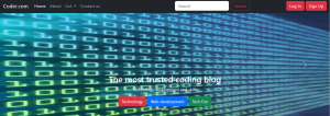
This Carousel component basically adds features to your webpage which makes it look attractive. It creates a skeleton framework of the website. By using this code you will get the following results in addition to the earlier component on your webpage.
 3.BUTTON FUNCTION
We can use Bootstrap’s custom button styles for actions in forms, dialogs, and more with support for multiple sizes, states, and more.
In addition to this, Bootstrap has a base .btn class that sets up basic styles such as padding and content alignment. By default, .btn controls have a transparent border and background color, and lack any explicit focus and hover styles.
We have implemented the Buttons component in the given snippet:
 <button class="btn btn-danger">Technology</button>
 <button class="btn btn-primary">Web development</button>
 <button class="btn btn-success">Tech Fun</button>
We can also change the color of the buttons in the same way as we have done above, by using the keywords danger(for red), success(for green) and primary(for blue).
The above code will give the following results on the webpage.
![]() 4.CARDS COMPONENT
4.CARDS COMPONENT
The cards feature of Bootstrap offers a versatile and expandable content container with several variations and configurations.
Cards component can easily be implemented and gives a subtle look to a blogging website. We have implemented cards in two places in our code.
1.World and Design feature
<div class="container my-4">
    <div class="row mb-2">
      <div class="col-md-6">
        <div class="row g-0 border rounded overflow-hidden flex-md-row mb-4 shadow-sm h-md-250 position-relative">
          <div class="col p-4 d-flex flex-column position-static">
            <strong class="d-inline-block mb-2 text-primary-emphasis">World</strong>
            <h3 class="mb-0">Featured post</h3>
            <div class="mb-1 text-body-secondary">Nov 12</div>
            <p class="card-text mb-auto">This is a wider card with supporting text below as a natural lead-in to additional content.</p>
            <a href="#" class="icon-link gap-1 icon-link-hover stretched-link" >Continue reading
              <svg class="bi">
                <use xlink:href="#chevron-right"></use>
              </svg>
            </a>
          </div>
          <div class="col-auto d-none d-lg-block">
            <img class="bd-placeholder-img" width="500px" height="250px" src="../code 4.webp" alt="">
          </div>
        </div>
      </div>
      <div class="col-md-6">
        <div class="row g-0 border rounded overflow-hidden flex-md-row mb-4 shadow-sm h-md-250 position-relative">
          <div class="col p-4 d-flex flex-column position-static">
            <strong class="d-inline-block mb-2 text-success-emphasis">Design</strong>
            <h3 class="mb-0">Post title</h3>
            <div class="mb-1 text-body-secondary">Nov 11</div>
            <p class="mb-auto">This is a wider card with supporting text below as a natural lead-in to additional
              content.</p>
            <a href="#" class="icon-link gap-1 icon-link-hover stretched-link">
              Continue reading
              <svg class="bi">
                <use xlink:href="#chevron-right"></use>
              </svg>
            </a>
          </div>
          <div class="col-auto d-none d-lg-block">
            <img class="bd-placeholder-img" width="500px" height="250px" src="../code 5.webp">
          </div>
        </div>
      </div>
    </div>
  </div>
The above code will give the following output:
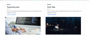
The Card component can be used to indicate something on the website. In the above syntax we have used two cards names WORLD and DESIGN which contains some information and images which were used in the program by using the basic img class.
2.Featured Card Component
The featured card was used in the webpage by using the given syntax:
<div class="card text-center">
    <div class="card-header">
      Featured
    </div>
    <div class="card-body">
      <h5 class="card-title">Special title treatment</h5>
      <p class="card-text">With supporting text below as a natural lead-in to additional content.</p>
      <a href="#" class="btn btn-primary">Go somewhere</a>
    </div>
    <div class="card-footer text-body-secondary">
      2 days ago
    </div>
  </div>
The above code will give the following output:

This adds a featured card component at the end of the web page which completes the overall look of the webpage.
5.MODAL
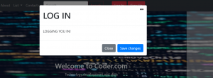
We can use Bootstrap’s JavaScript modal plugin to add dialogs to your site for lightboxes, user notifications, or completely custom content. It adds a dialogue box to the nav bar buttons which can be used to show a particular prompt.
NOTE: Bootstrap only supports one modal window at a time. Nested modals aren’t supported as we believe them to be poor user experiences.
6.FOOTER
A footer is an additional navigation element that may contain a variety of content, such as links, buttons, company information, forms, and more. For instance, a basic footer might include text, links, and a copyright section.
To customize the appearance of the footer, you can adjust the background color using a CSS class like .bg-body-tertiary.
The syntax for adding a footer is given below:
<footer class="py-5 text-center text-body-secondary bg-body-tertiary">
    <p>Blog template built for <a href="https://getbootstrap.com/">Bootstrap</a> by <a href="https://twitter.com/mdo">@mdo</a>.</p>
    <p class="mb-0">
      <a href="#">Back to top</a>
    </p>
  </footer>
The result of the above code will be:

The final webpage after using all the components would look something like this:
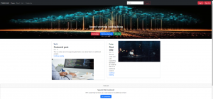
Hence, by using the above all components of Bootstrap you can make a very simple and usable website for any school or university related work. These components are the most basic and important components for Frontend, without which you would not be able to make a proper website.
This article would provide a great start to your Frontend journey in web development by providing you all the components and functions of Bootstrap.



Nice workk:)
Thankyou for relaying such vital information simply. It helped a lot . Good work.
Good job
Truly insightful! Keep going⚡️⚡️